Monthly Archives: February 2014
Continuity between Digipak and Advert
We believed it to be extremely important to maintain a significant amount of continuity between the ancillary tasks as this is evident with professional and established artists within the music industry. This is highly important as it is crucial that the audience/viewers are able to establish significant links between the album and posters and music videos for them to be able to recognise our artist. We believe this will demonstrate advanced marketing skills for the artist. Therefore, we have capitalised on the bright colours/font/monochrome background for each of the ancillary tasks in order for distinctive and obvious links between the two to be made.
Evidently there is a distinct link made between the two elements of our ancillary tasks. However, we have also demonstrated a sufficient amount of contrast between the two to ensure they are both not exactly the same. Therefore for our advert we decided to display a symmetrical design and show LUNA on both sides of the advert. This is also due to the fact this was a practical design for our poster as we found it to be balanced and symmetrical with image and text.
Links between our: Music Video – Digipak – Poster
Throughout our music video, digipak and final poster we have tried to maintain a significant amount of continuity between each aspect of our A2 Media Studies coursework. This is evident through the use of colours/ costume and the overall identity of LUNA. Below shows a diagram of how our different elements of our coursework interlink and cross reference.
Firstly, throughout our music video we attempted to create an edgy look for LUNA especially through the brightly coloured clothing. LUNA’s main costume within the music video is the long sleeved digital print top, consisting of various tones and shades of purple/blue/green. This acted as our inspiration for the rest of our music video as we believed this print highly reflected an image of LUNA we wanted to portray. As this piece of clothing is edgy and different we believed these characteristics are highlighted within the song – GRAMMY. Below shows various screenshots throughout our music video where the use of bright colours is evident.
These are three examples of LUNA’s costumes throughout the music video. The digital print top being most evident within the music video. However, the other two costumes show bright colours, for example with the black dress LUNA wears a neon necklace – therefore we are maintaining this element. Additionally, the pink snakeskin costume exposes bright colours aswell. Although it is not just within the costumes that bright colours are shown, also within the lighting:
Within the music video for GRAMMY the motif sequence of these lights is repeated throughout to emphasise the colours significance as it represents LUNA’s personality and character. Thus, some of these colours are used for the digipak and poster – especially the colour purple.
Below shows a diagram highlighting the links between all of our media studies coursework spectrum. Evidently showing that the costume LUNA wears within the music video acts as a strong foundation and inspiration for the rest of our coursework.
The print of the top was our inspiration for our LUNA logo. To maintain a strong level of continuity for the rest of our digipak and advert we used this print for the cover of our album and advert/poster, creating a pop-art image of LUNA. We believe that this print is extremely distinctive and original for our artist LUNA. There is also a strong link with the pop genre: bright colours and pop font and the focus of the artist as LUNA appears on the front cover of the album and poster.
Different Designs for Advert – Audience Feedback
As we have designed 3 different options for our advert to promote our artist LUNA. We felt this was a prime opportunity to complete an extensive piece of audience feedback to find out what the general consensus was about our advert. Evidently, the pie chart displays our findings from this survey and Design 1 gained 2 votes, Design 2 gained 3 votes and Design 3 gained 15 votes. As our survey was completed by 20 individuals, our research shows that with a 75% gain – Design 3 ultimately seemed more popular with the public. As we also agreed with this answer, we have decided to create design 3 as our final advert.
Along with our survey we asked the people taking part: why have you chosen this design? and, what didn’t you like about the other designs?
The main comments made about these questions were:
– Design 1 and 2 were too similar to the digipak – almost identical. Therefore, if you choose Design 3 it is more original and reflects LUNA’s identity better.
– Design 3 demonstrates a balanced design
– The framing od Design 3 is original and cool
Similar Artists Digipak and Adverts – Research
We have completed extensive research on this topic in order for us to successfully create our own advert which links with our digipak. Our research shows that the main links between the digipak and advert for pop artists are:
1) The same font is used for the title and name of the artist
2) Extremely similar colours are demonstrated on each of the promotional pieces
3) The image of the artist is extremely similar on each of the pieces however there are always slight differences
4) Social networking icons are displayed on the advert: Twitter/Facebook/Website
5) More information is shown on the advert
6) Ratings and reviews from highly respected companies within the music industry
3 Designs for our Advert
Below are the three different draft designs for our advert. They display the basic and rough outline/placing/framing of our potential advert.
Design 1: Luna’s face is placed in the middle of the advert
Design 2: Luna’s face is placed lower down the advert
Design 3: Luna’s face is cropped in half and placed symmetrically either side of the advert
We will be conducting a survey to find out what the general consensus of the advert is.
Time Management and Organisation
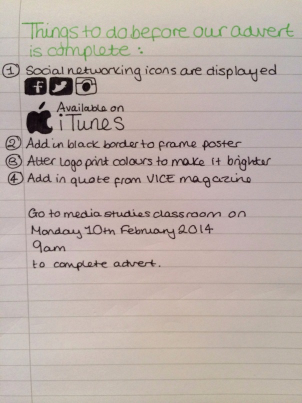
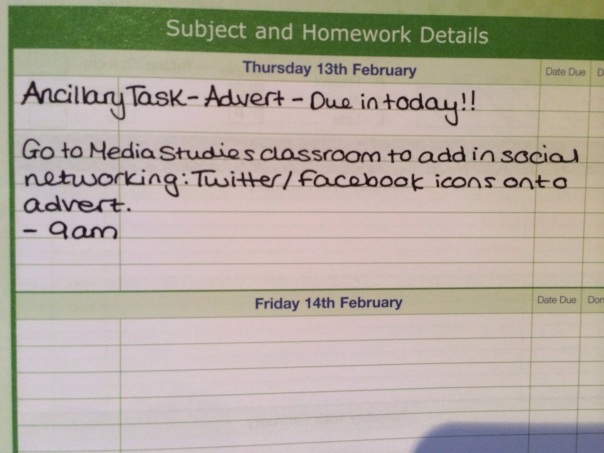
I have entered the deadline date into my school planner to ensure we meet the deadlines and successfully use our time management to make sure we finish our advert poster by Thursday 13th February. As we have almost finished the advert and we only have final touches to add onto the poster including social networking icons we are going to go to the media studies classroom in the morning to finish this.
Feedback for initial advert idea
We asked our classmates for their personal feedback for our initial ideas for our advert poster for Luna.
Conventions of a Magazine Advert
We have used these features of a magazine advert to start creating our own advert for our artist, LUNA. We are going to have 3 ratings in the centre of the advert. We have researched similar artists and the music companies who have rated and reviewed pop artists. Such companies include: MTV, Billboard, Rolling Stones. Therefore we are going to include various reviews and ratings on our poster as this appears to be a genre characteristic. Additionally, we are going to conform to each of these conventions in order to appear as professional as we can and as realistic for the pop genre our artist belongs in.


