Continuity between Digipak and Advert
We believed it to be extremely important to maintain a significant amount of continuity between the ancillary tasks as this is evident with professional and established artists within the music industry. This is highly important as it is crucial that the audience/viewers are able to establish significant links between the album and posters and music videos for them to be able to recognise our artist. We believe this will demonstrate advanced marketing skills for the artist. Therefore, we have capitalised on the bright colours/font/monochrome background for each of the ancillary tasks in order for distinctive and obvious links between the two to be made.
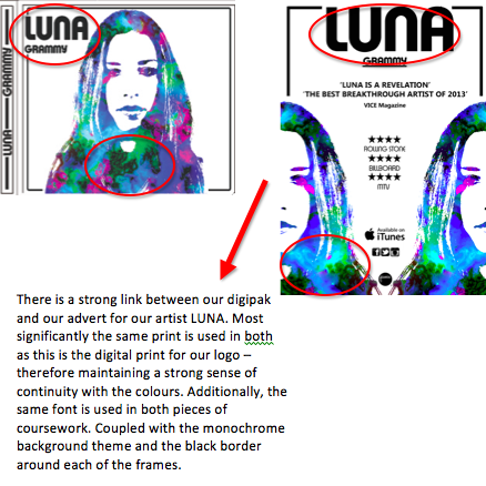
Evidently there is a distinct link made between the two elements of our ancillary tasks. However, we have also demonstrated a sufficient amount of contrast between the two to ensure they are both not exactly the same. Therefore for our advert we decided to display a symmetrical design and show LUNA on both sides of the advert. This is also due to the fact this was a practical design for our poster as we found it to be balanced and symmetrical with image and text.
Posted on February 20, 2014, in Ancillary Tasks and tagged Britney Sullivan, Daniel Gorsuch, Maxwell Pope. Bookmark the permalink. Leave a comment.

Leave a comment
Comments 0