Links between our: Music Video – Digipak – Poster
Throughout our music video, digipak and final poster we have tried to maintain a significant amount of continuity between each aspect of our A2 Media Studies coursework. This is evident through the use of colours/ costume and the overall identity of LUNA. Below shows a diagram of how our different elements of our coursework interlink and cross reference.
Firstly, throughout our music video we attempted to create an edgy look for LUNA especially through the brightly coloured clothing. LUNA’s main costume within the music video is the long sleeved digital print top, consisting of various tones and shades of purple/blue/green. This acted as our inspiration for the rest of our music video as we believed this print highly reflected an image of LUNA we wanted to portray. As this piece of clothing is edgy and different we believed these characteristics are highlighted within the song – GRAMMY. Below shows various screenshots throughout our music video where the use of bright colours is evident.
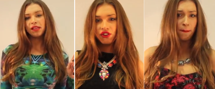
These are three examples of LUNA’s costumes throughout the music video. The digital print top being most evident within the music video. However, the other two costumes show bright colours, for example with the black dress LUNA wears a neon necklace – therefore we are maintaining this element. Additionally, the pink snakeskin costume exposes bright colours aswell. Although it is not just within the costumes that bright colours are shown, also within the lighting:

Within the music video for GRAMMY the motif sequence of these lights is repeated throughout to emphasise the colours significance as it represents LUNA’s personality and character. Thus, some of these colours are used for the digipak and poster – especially the colour purple.
Below shows a diagram highlighting the links between all of our media studies coursework spectrum. Evidently showing that the costume LUNA wears within the music video acts as a strong foundation and inspiration for the rest of our coursework.

The print of the top was our inspiration for our LUNA logo. To maintain a strong level of continuity for the rest of our digipak and advert we used this print for the cover of our album and advert/poster, creating a pop-art image of LUNA. We believe that this print is extremely distinctive and original for our artist LUNA. There is also a strong link with the pop genre: bright colours and pop font and the focus of the artist as LUNA appears on the front cover of the album and poster.
Posted on February 20, 2014, in Ancillary Tasks and tagged Britney Sullivan. Bookmark the permalink. 1 Comment.

Britney, These posts are amazingly detailed. Well done! You are an excellent blogger; a real example of how blogging should be done.
One suggestion. Change the theme of your blog to reflect the artist (colours).
Mr. Dunford