


Category Archives: Evaluation
4) How did you use new media technologies in the construction and research, planning and evaluation stages?
Here is a powerpoint of our analysis of all the hardware as well as all of the software that we have used during this process. We have gone into detail to really explain the work we completed and the time it spent to not only learn how to use the technology but to then complete the tasks.
Evaluation Question 3) What have you learned from your audience feedback?
Positive and Negative Feedback Evaluation
We have collected all of our feedback together from our animatic and our treatment which includes both positive and negative feedback. We then categorised the feedback into the positives and the negatives then making a wordle from the specific words that descried our pitch and our video. The feedback we were given was from both our peers and our teachers allowing us to gain as much feedback as possible. We scanned through our feedback and have picked out the key words that we thought helped us develop the video we had created as a final product. To help develop our ideas we took the feedback to then change or create new ideas for the video which then helped us deliver trial shots for our peers to then criticize again. After the animatic we had a clear idea of the structure of the video for example the order all the shots will be going in and the duration of the shots. The next step was taking out some of the shots as we then had too much footage for our rough cut video. This helped us decide what was crucial for our video and what wasn’t needed within our video.
Dailies and Rough Cut Feedback
After completing our rough cut, we received much helpful feedback from our Media Studies teacher and peers. The negative feedback on our rough cut such as making the narrative stronger, we found significantly helpful as this assisted our progression towards our final music video. We used this element of feedback by adding in additional shots from the ‘night’ scene at the ‘party’ and also shots of LUNA in her bedroom – to help us convey the emotions she was feeling. Also, the suggestions to re-shoot some of the studio shots where our actress, Zara, was looking down and to the side when lip-syncing were helpful. After receiving this feedback we re-shot some of the frames. This had a positive effect on our final music video as LUNA was looking directly to the camera, which we feel built more atmosphere and made it appear more professional. Additionally, the night scene in our rough cut appeared to our audience to be lacking energy and light. Therefore, we added in the coloured light sequence to build a party atmosphere. Also, we re-shot much of the night scene with extra lighting equipment, making the shots more defined. Due to the positive feedback on the jump cuts throughout our rough cut, we decided to add in more of this style of editing as it was clearly pleasing to the audience which we feel gave our music video more pace and energy in the final product. The dailies feedback was crucial to our development towards our final music video. A main point raised within the dailies feedback regarded the initial costume for LUNA. At first we filmed LUNA wearing a plain black top and skirt, this appeared dull and boring to our audience, there were many suggestions for LUNA to wear multiple costumes throughout the music video to complement the mise-en-scene, also for the costumes to be bright and colourful – this conformed to the pop genre characteristics. Also, it was suggested for LUNA to wear bright jewellery – after taking this on board, it significantly improved of final music video. Overall, all of the comments and suggestions made within the feedback in regards to our rough cut was extremely helpful and significantly contributed to the development of our final music video.
Digipak and Advert Feedback
The brainshark we have comlpeted describes the feedback we were given for our DIgipak and our Advert. We have discussed our progress and how we changed the rough design due to the feedback we were given making the final product. This progressed us a group to organise our time more effectively, as well as progressing our skills with photoshop. Due to all the drafts we completed for the Digipak, by the time we created our final product we had alot more knowledge and knew exactly how to create our ideas. Our ideas progressed through discussion not only within the group, but also with our peers giving us critisicm to help us develop ideas.
Here is a link of our mybrainshark powerpoint as we analyse our feedback for our digipak and advert:

http://my.brainshark.com/Digipak-and-Advert-Feedback-560676169


")
")


Music Video Evaluation Task 1
In what ways does your media product use, develop or challenge forms and conventions of real meadia products? (i.e Music Videos)
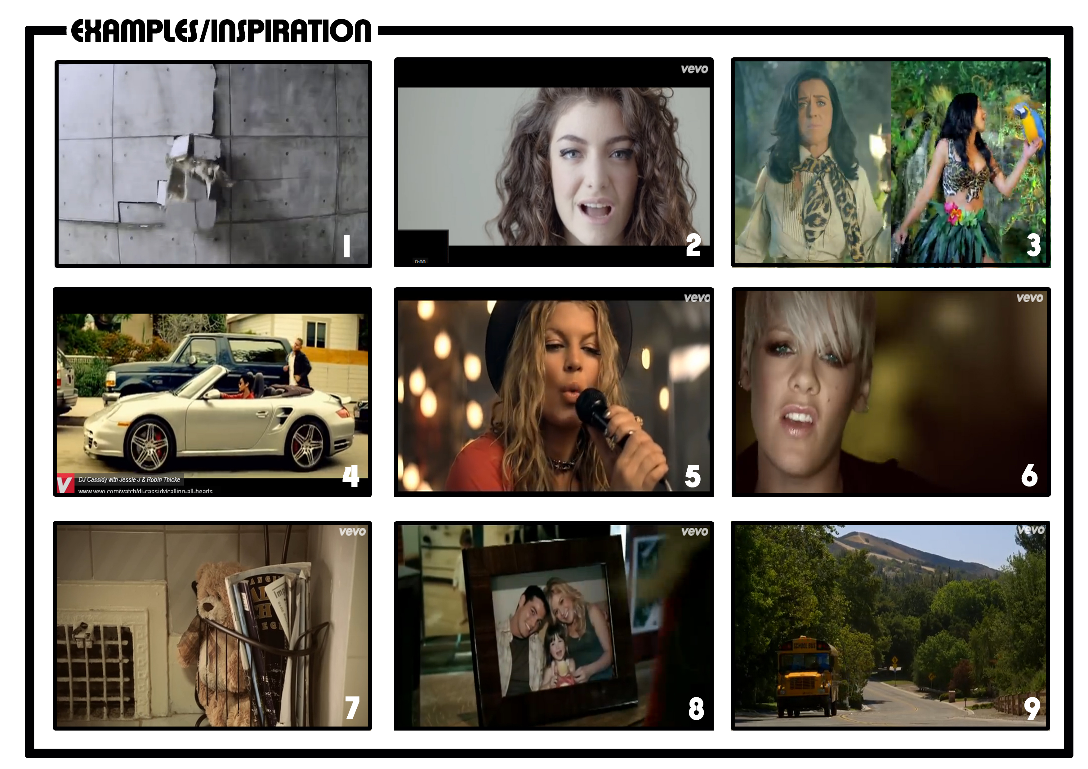
Here is an evaluation of not only our music video bu other world known artists that use good framing, lighting and mise-en-scene. I have decided to use microanalysis within this nine frame pane to really pin point the areas that we developed and also our weaknesses.

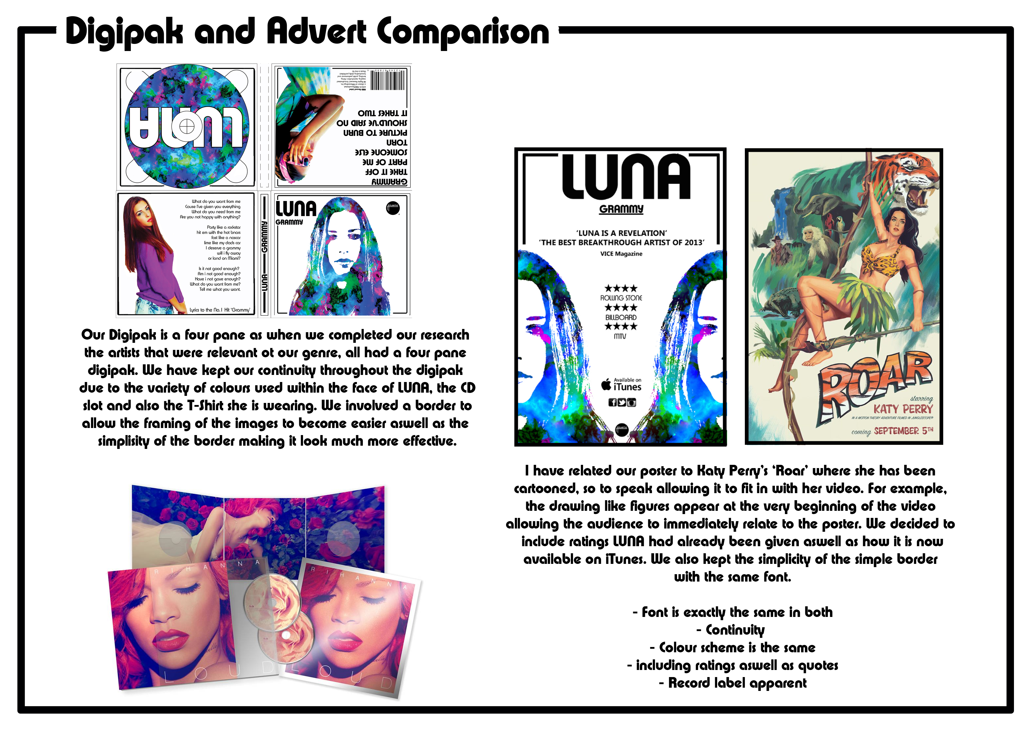
Analysis of our Digipak
Below is the front cover of our digipak. We chose this effect on the image as we believed it to be very effective and also due to the bright colours of purple green and blue this represents the identity of our artist – LUNA. We used the program Photoshop to achieve this effect. The background layer is the print of our LUNA logo, we thought this would be effective and distinctive to the identity of LUNA. Also, we used the same font of our logo- Xpress SF Bold for our title ‘LUNA’ and the name of the album ‘GRAMMY’. Therefore the audience can make links between the logo of LUNA and the front cover, heightening the continuity between the logo and the artist. There is also a black border framing the image of LUNA, reinforcing the importance of the image of LUNA. As the background is plain white with a black border and black title, this enhances the bright colours of purple, green and blue on the background as there is such a strong juxtaposition of colours. We also wanted to make a link between the font and title on the album cover with the spine of the digipak. We continued the black line used for the border and also used the same font. The framing of the features on the album cover are very important as the image of LUNA is directly placed in the centre of the album cover, conveying that the artist is the most distinctive feature of the digipak and the focus should remain on the artist LUNA (this is a genre characteristic for pop). We made the title of the album in a bold black font so the audience can notice it but not fully take away the focus on the artist.


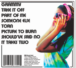
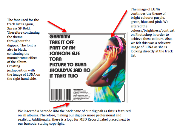
This is the back pane of our digipak. Evidently we maintained the themes of white background, bold black font (Xpress SF Bold) and the bright colours of our artist. This pane focuses on the track list of the album, the tracklist is located on the left hand side of the pane and Luna is situated directly on the opposite side looking directly at the tracklist. We believe this framing of the pane to be effective as it is evenly balanced. The barcode and MBD Record Label logo is also a feature of the back page as this is a common feature of a digipak. The image of LUNA is very bright and juxtaposes the monochrome effect of the pane. LUNA is wearing a tie-dye green, purple and blue top, along with a pair of pink sunglasses and a pink bandana. We altered the colours of this image in order to match the rest of LUNA’s identity.
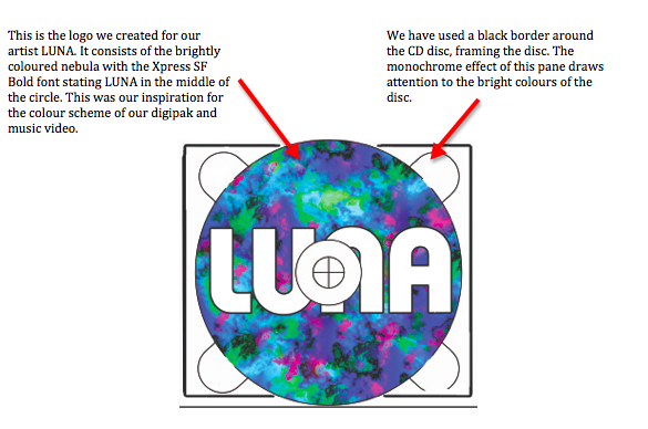
This is our CD disc pane of our digipak. It consists of our LUNA logo – a brightly coloured nebula with a bold title ‘LUNA’ in Xpress SF Bold in the middle of the circle. We believed this was a perfect image for our CD disc as it would fit well and also be effective. Evidently, the bright colour theme is continued onto this pane, along with the monochrome effect: white background and black border.

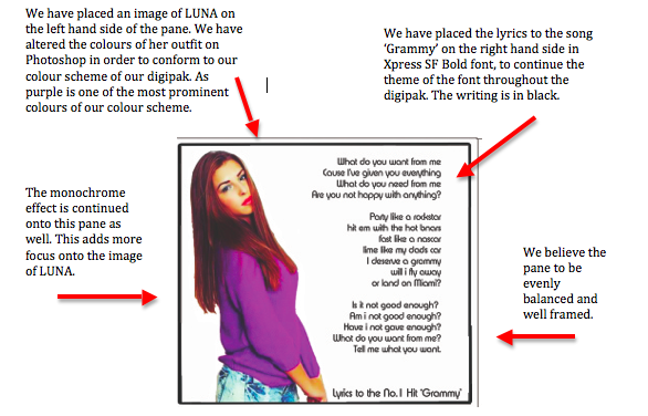
Lastly, this is our middle pane within the digipak. As pop genre digipaks usually focus around the artist and their appearance as opposed to just the music itself, we believed this pane should consist of another image of LUNA. Therefore, we used an image of LUNA and placed this image on the left of the pane and placed the lyrics of the song ‘Grammy’ on the other side of the pane. We altered the colours on the image to make the jumper she is wearing bright purple and the denim shorts she is also wearing brightly coloured blue and green. Therefore, creating tremendous continuity throughout the digipak. Additionally, the white background is used on this pane to make the colours of LUNA more effective. Also, the black border is used along with the black writing for the lyrics in Xpress SF Bold. Through carrying out extensive research within the pop genre for digipaks, we found out that a lyrics page proves very popular with a lot of artists.

Evidently, throughout our digipak we have made sure that a tremendous amount of continuity is portrayed. We have done this through:
1) Bright colours of purple, green and blue. All of these colours are used within each of the panes.
2) White background on each of the panes within the digiapk.
3) A black border on each of the panes
4) Black writing on each of the panes – Xpress SF Bold
Digipak Evaluation
Below is a video of MBD explaining our decisions made for our digipak draft. We considered our artists representation, audience and links to genre.
Below is a video of fellow classmates evaluating our Digipak draft. We received a lot of constructive critiscm from them and we are going to improve our Digipak by using their feedback.
