Category Archives: Research & Planning
Similar Artists Digipak and Adverts – Research
We have completed extensive research on this topic in order for us to successfully create our own advert which links with our digipak. Our research shows that the main links between the digipak and advert for pop artists are:
1) The same font is used for the title and name of the artist
2) Extremely similar colours are demonstrated on each of the promotional pieces
3) The image of the artist is extremely similar on each of the pieces however there are always slight differences
4) Social networking icons are displayed on the advert: Twitter/Facebook/Website
5) More information is shown on the advert
6) Ratings and reviews from highly respected companies within the music industry
Conventions of a Magazine Advert
We have used these features of a magazine advert to start creating our own advert for our artist, LUNA. We are going to have 3 ratings in the centre of the advert. We have researched similar artists and the music companies who have rated and reviewed pop artists. Such companies include: MTV, Billboard, Rolling Stones. Therefore we are going to include various reviews and ratings on our poster as this appears to be a genre characteristic. Additionally, we are going to conform to each of these conventions in order to appear as professional as we can and as realistic for the pop genre our artist belongs in.
Album Cover Inspiration
Our media technician, Lolly, has inspired us through her work for our album cover for Luna. Lolly had already created an example image of Lady Gaga with lyrics from her new song ‘Do what u want’ in different colours to create the outline of her face. We thought this was a very effective album cover and decided this would be appropriate and unique for our own digipak for Luna. However, instead of the lyrics over her face, we will write ‘LUNA’ over her face as it is the album cover and not the lyrics page. This was a debate we encountered – whether to use this effect for the album cover or the lyrics page. However, as we had to use different brightness effects with the text ‘LUNA’ over her face so the eyes were more defined, this would have led to not being able to see the lyrics properly. Therefore, we decided to choose the effect for the album cover.
We are going to use the exact same colours as those used in the logo by identifying the exact code numbers for the shade of colour. These colours will mainly consist of: pink, green, purple and blue. Therefore continuing the theme of the bright colours throughout the digipak. Luna’s face will be on a white background making the text more prominent.
This is an image of Lolly’s image:

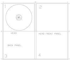
Change to 4 pane Digipak
We had originally designed a 6-pane digipak for our artist. However, as we pitched this idea to our media studies teacher and fellow classmates, a lot of people believed a 4 pane digipak would be more suitable and look far more effective. Therefore, we reconsidered the digipak template we would use. After completing more research on the topic we found that 4 pane digipak was just as popular within the pop genre. As we would have had 2 discs with the same print – we believed the digipak would look more effective with just one disc (4-pane template) and also if we had used a 6 pane digipak the print may have been over used as we are planning to use this print for our advert as well.
Our plan:
Front pane – An image of LUNA placed in the centre to establish our artist
CD disc – logo print
3rd pane – An image of LUNA and the lyrics to the song GRAMMY
Back pane – A track list and image of LUNA
All of the panes will consist of the same colours, just differing in shades and tones. Also a monochrome background for each of the panes.
Digipak Draft – Explanation

Album Cover:
Through extensive research we have decided to use bright colours throughout the album cover as this was very popular with other female pop artists such as Miley Cyrus, Britney Spears and Katy Perry. Also, as the use of bright colours is a prominent feature throughout our music video. Therefore, we want to continue using this theme. Additionally, as the artist usually appears on the front of ther album cover in the pop genre – we want to use Luna’s face as the album cover. Luna will be in the centre of the cover and she will be wearing an outfit shown in the music video, demonstrating continuity. The font will be the same as the Luna logo, showing a running theme.

The top that Luna will be wearing is a digital print top shown below:

We believe that this is a suitable outfit that reflects our artist, Luna’s identity. The bright colours of green, blue and purple are also the same as the new Luna logo – creating a similarity between the different aspects of Luna’s identity.
CD Disc:
The 2 discs will have a nebula print – the same as the one on the logo, again demonstrating continuity. We want to use the same print so the audience can see the links between the album cover and our artisty. Also, the same font – Xpress heavy SF – will be used. We originally wanted to have Luna’s eyes in the background of the ‘LUNA’ title, however, by carrying out audience feedback, people have commented that this will look to busy and chaotic. The disc will also consist of the same bright colours.

Picture Pages:
As we have noticed pop artists album cover’s generally revolve around the artists appearance and image of the person, we want to conform to this genre characteristic. Therefore, on the picture pages we want to have images again of Luna. As well as the track list and lyrics page.
Digipak Drawn Draft Requirements
Below shows a Scribd document listing the requirements for the drawn digipak draft requirements.
Digipak – Planning
Above shows a diagram we will be using to make sure we continue to stick to our intended Luna identity. The main purpose of this diagram is for continuity and synergy between each of the elements of our coursework. Meaning, that the music video relates and is similar to our digipak and also our advert. Therefore, we will need to remain building the ‘Luna’ image in the same way in each of the elements of the coursework. We have put the ‘Luna’ logo in the middle of the diagram to show this is what is most important in each of the areas of the triangle.
