Category Archives: Shotlists, Layouts, Drafting, Scripting, Storyboarding
Different Designs for Advert – Audience Feedback
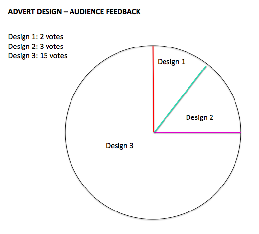
As we have designed 3 different options for our advert to promote our artist LUNA. We felt this was a prime opportunity to complete an extensive piece of audience feedback to find out what the general consensus was about our advert. Evidently, the pie chart displays our findings from this survey and Design 1 gained 2 votes, Design 2 gained 3 votes and Design 3 gained 15 votes. As our survey was completed by 20 individuals, our research shows that with a 75% gain – Design 3 ultimately seemed more popular with the public. As we also agreed with this answer, we have decided to create design 3 as our final advert.
Along with our survey we asked the people taking part: why have you chosen this design? and, what didn’t you like about the other designs?
The main comments made about these questions were:
– Design 1 and 2 were too similar to the digipak – almost identical. Therefore, if you choose Design 3 it is more original and reflects LUNA’s identity better.
– Design 3 demonstrates a balanced design
– The framing od Design 3 is original and cool
3 Designs for our Advert
Below are the three different draft designs for our advert. They display the basic and rough outline/placing/framing of our potential advert.
Design 1: Luna’s face is placed in the middle of the advert
Design 2: Luna’s face is placed lower down the advert
Design 3: Luna’s face is cropped in half and placed symmetrically either side of the advert
We will be conducting a survey to find out what the general consensus of the advert is.


Analysis of our Digipak
Below is the front cover of our digipak. We chose this effect on the image as we believed it to be very effective and also due to the bright colours of purple green and blue this represents the identity of our artist – LUNA. We used the program Photoshop to achieve this effect. The background layer is the print of our LUNA logo, we thought this would be effective and distinctive to the identity of LUNA. Also, we used the same font of our logo- Xpress SF Bold for our title ‘LUNA’ and the name of the album ‘GRAMMY’. Therefore the audience can make links between the logo of LUNA and the front cover, heightening the continuity between the logo and the artist. There is also a black border framing the image of LUNA, reinforcing the importance of the image of LUNA. As the background is plain white with a black border and black title, this enhances the bright colours of purple, green and blue on the background as there is such a strong juxtaposition of colours. We also wanted to make a link between the font and title on the album cover with the spine of the digipak. We continued the black line used for the border and also used the same font. The framing of the features on the album cover are very important as the image of LUNA is directly placed in the centre of the album cover, conveying that the artist is the most distinctive feature of the digipak and the focus should remain on the artist LUNA (this is a genre characteristic for pop). We made the title of the album in a bold black font so the audience can notice it but not fully take away the focus on the artist.


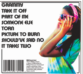
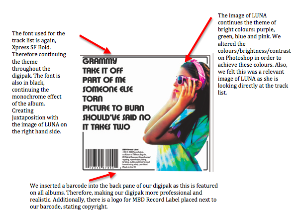
This is the back pane of our digipak. Evidently we maintained the themes of white background, bold black font (Xpress SF Bold) and the bright colours of our artist. This pane focuses on the track list of the album, the tracklist is located on the left hand side of the pane and Luna is situated directly on the opposite side looking directly at the tracklist. We believe this framing of the pane to be effective as it is evenly balanced. The barcode and MBD Record Label logo is also a feature of the back page as this is a common feature of a digipak. The image of LUNA is very bright and juxtaposes the monochrome effect of the pane. LUNA is wearing a tie-dye green, purple and blue top, along with a pair of pink sunglasses and a pink bandana. We altered the colours of this image in order to match the rest of LUNA’s identity.
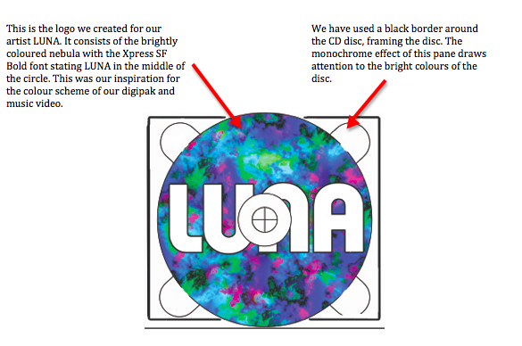
This is our CD disc pane of our digipak. It consists of our LUNA logo – a brightly coloured nebula with a bold title ‘LUNA’ in Xpress SF Bold in the middle of the circle. We believed this was a perfect image for our CD disc as it would fit well and also be effective. Evidently, the bright colour theme is continued onto this pane, along with the monochrome effect: white background and black border.

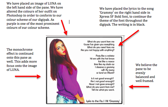
Lastly, this is our middle pane within the digipak. As pop genre digipaks usually focus around the artist and their appearance as opposed to just the music itself, we believed this pane should consist of another image of LUNA. Therefore, we used an image of LUNA and placed this image on the left of the pane and placed the lyrics of the song ‘Grammy’ on the other side of the pane. We altered the colours on the image to make the jumper she is wearing bright purple and the denim shorts she is also wearing brightly coloured blue and green. Therefore, creating tremendous continuity throughout the digipak. Additionally, the white background is used on this pane to make the colours of LUNA more effective. Also, the black border is used along with the black writing for the lyrics in Xpress SF Bold. Through carrying out extensive research within the pop genre for digipaks, we found out that a lyrics page proves very popular with a lot of artists.

Evidently, throughout our digipak we have made sure that a tremendous amount of continuity is portrayed. We have done this through:
1) Bright colours of purple, green and blue. All of these colours are used within each of the panes.
2) White background on each of the panes within the digiapk.
3) A black border on each of the panes
4) Black writing on each of the panes – Xpress SF Bold
Album Cover Inspiration
Our media technician, Lolly, has inspired us through her work for our album cover for Luna. Lolly had already created an example image of Lady Gaga with lyrics from her new song ‘Do what u want’ in different colours to create the outline of her face. We thought this was a very effective album cover and decided this would be appropriate and unique for our own digipak for Luna. However, instead of the lyrics over her face, we will write ‘LUNA’ over her face as it is the album cover and not the lyrics page. This was a debate we encountered – whether to use this effect for the album cover or the lyrics page. However, as we had to use different brightness effects with the text ‘LUNA’ over her face so the eyes were more defined, this would have led to not being able to see the lyrics properly. Therefore, we decided to choose the effect for the album cover.
We are going to use the exact same colours as those used in the logo by identifying the exact code numbers for the shade of colour. These colours will mainly consist of: pink, green, purple and blue. Therefore continuing the theme of the bright colours throughout the digipak. Luna’s face will be on a white background making the text more prominent.
This is an image of Lolly’s image:

Digipak links to Artist/Music Video
During our Music Video, on two occasions, there are flashes of studio lights, consisting of a number of bright colours. Taking this into consideration, we have tried to make the colour scheme for our digipak, including the logo out of very bright colours. By doing so, links are established between the digipak and Luna giving a sense of continuity between the two pieces of media.
During our video, Luna is seen to mainly be wearing a bright top consisting of the colours; blue, purple and green. 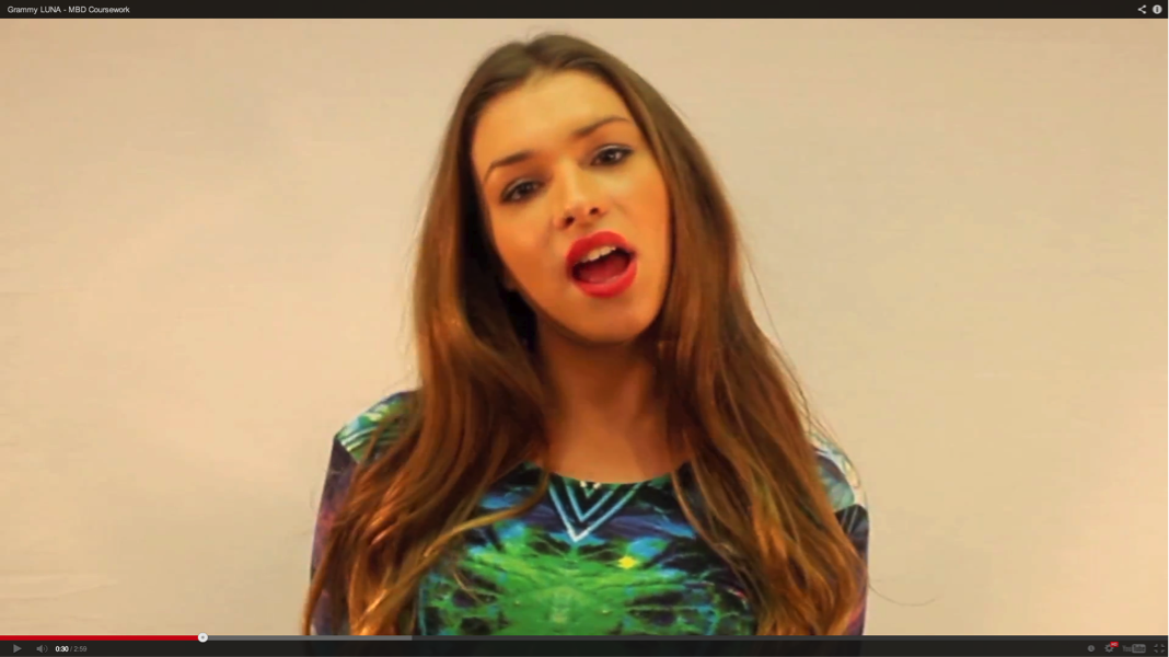 As this is the main outfit Luna wears throughout the duration of the video, we thought it would be appropriate to base our logo colour scheme off of this clothing.
These colours feature on the two disk covers we have. 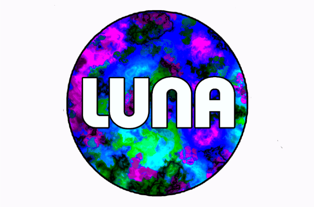 Our front cover for the digipak is an image of Zara, with a very bright white colour in the background. We think this links well with our artist and the music video because it is eye catching, bright and features a picture of Zara.
Change to 4 pane Digipak
We had originally designed a 6-pane digipak for our artist. However, as we pitched this idea to our media studies teacher and fellow classmates, a lot of people believed a 4 pane digipak would be more suitable and look far more effective. Therefore, we reconsidered the digipak template we would use. After completing more research on the topic we found that 4 pane digipak was just as popular within the pop genre. As we would have had 2 discs with the same print – we believed the digipak would look more effective with just one disc (4-pane template) and also if we had used a 6 pane digipak the print may have been over used as we are planning to use this print for our advert as well.
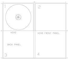
Our plan:
Front pane – An image of LUNA placed in the centre to establish our artist
CD disc – logo print
3rd pane – An image of LUNA and the lyrics to the song GRAMMY
Back pane – A track list and image of LUNA
All of the panes will consist of the same colours, just differing in shades and tones. Also a monochrome background for each of the panes.
Changing the LUNA logo
Our original LUNA logo consisted of a full moon and two half moons attached on either side, also, the colours were slightly dull. Throughout the process of building our artist, LUNA’s identity has evolved into bright colours. Therefore, we felt it was necessary to include brighter colours in the logo as our music video consists of many bright colours and we wanted to continue this theme throughout Luna’s identity. Additionally, by carrying out extensive audience feedback many comments were made about the two half moons attached to the middle circle and no one could see the relevance of this feature on the logo. Thus, we decided to erase these 2 moons as they no longer had any relevance to our artist. We have decided to focus more on the bright colours on the logo, making it stand out and distinctive. We have also added in a black outline on the LUNA title and outline around the circle of the logo, this results in the name of LUNA standing out more.
Here is our new logo:

Here is our original logo:
![]()
Digipak Evaluation
Below is a video of MBD explaining our decisions made for our digipak draft. We considered our artists representation, audience and links to genre.
Below is a video of fellow classmates evaluating our Digipak draft. We received a lot of constructive critiscm from them and we are going to improve our Digipak by using their feedback.
Digipak Draft – Explanation

Album Cover:
Through extensive research we have decided to use bright colours throughout the album cover as this was very popular with other female pop artists such as Miley Cyrus, Britney Spears and Katy Perry. Also, as the use of bright colours is a prominent feature throughout our music video. Therefore, we want to continue using this theme. Additionally, as the artist usually appears on the front of ther album cover in the pop genre – we want to use Luna’s face as the album cover. Luna will be in the centre of the cover and she will be wearing an outfit shown in the music video, demonstrating continuity. The font will be the same as the Luna logo, showing a running theme.

The top that Luna will be wearing is a digital print top shown below:

We believe that this is a suitable outfit that reflects our artist, Luna’s identity. The bright colours of green, blue and purple are also the same as the new Luna logo – creating a similarity between the different aspects of Luna’s identity.
CD Disc:
The 2 discs will have a nebula print – the same as the one on the logo, again demonstrating continuity. We want to use the same print so the audience can see the links between the album cover and our artisty. Also, the same font – Xpress heavy SF – will be used. We originally wanted to have Luna’s eyes in the background of the ‘LUNA’ title, however, by carrying out audience feedback, people have commented that this will look to busy and chaotic. The disc will also consist of the same bright colours.

Picture Pages:
As we have noticed pop artists album cover’s generally revolve around the artists appearance and image of the person, we want to conform to this genre characteristic. Therefore, on the picture pages we want to have images again of Luna. As well as the track list and lyrics page.
