

")
")


Blog Archives
Evaluation Question 3) What have you learned from your audience feedback?
Positive and Negative Feedback Evaluation
We have collected all of our feedback together from our animatic and our treatment which includes both positive and negative feedback. We then categorised the feedback into the positives and the negatives then making a wordle from the specific words that descried our pitch and our video. The feedback we were given was from both our peers and our teachers allowing us to gain as much feedback as possible. We scanned through our feedback and have picked out the key words that we thought helped us develop the video we had created as a final product. To help develop our ideas we took the feedback to then change or create new ideas for the video which then helped us deliver trial shots for our peers to then criticize again. After the animatic we had a clear idea of the structure of the video for example the order all the shots will be going in and the duration of the shots. The next step was taking out some of the shots as we then had too much footage for our rough cut video. This helped us decide what was crucial for our video and what wasn’t needed within our video.
Dailies and Rough Cut Feedback
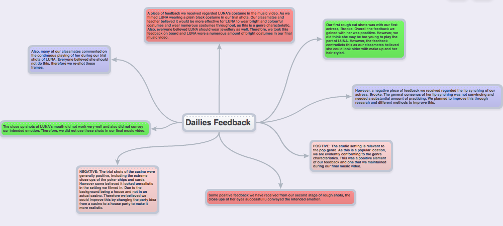
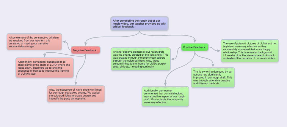
After completing our rough cut, we received much helpful feedback from our Media Studies teacher and peers. The negative feedback on our rough cut such as making the narrative stronger, we found significantly helpful as this assisted our progression towards our final music video. We used this element of feedback by adding in additional shots from the ‘night’ scene at the ‘party’ and also shots of LUNA in her bedroom – to help us convey the emotions she was feeling. Also, the suggestions to re-shoot some of the studio shots where our actress, Zara, was looking down and to the side when lip-syncing were helpful. After receiving this feedback we re-shot some of the frames. This had a positive effect on our final music video as LUNA was looking directly to the camera, which we feel built more atmosphere and made it appear more professional. Additionally, the night scene in our rough cut appeared to our audience to be lacking energy and light. Therefore, we added in the coloured light sequence to build a party atmosphere. Also, we re-shot much of the night scene with extra lighting equipment, making the shots more defined. Due to the positive feedback on the jump cuts throughout our rough cut, we decided to add in more of this style of editing as it was clearly pleasing to the audience which we feel gave our music video more pace and energy in the final product. The dailies feedback was crucial to our development towards our final music video. A main point raised within the dailies feedback regarded the initial costume for LUNA. At first we filmed LUNA wearing a plain black top and skirt, this appeared dull and boring to our audience, there were many suggestions for LUNA to wear multiple costumes throughout the music video to complement the mise-en-scene, also for the costumes to be bright and colourful – this conformed to the pop genre characteristics. Also, it was suggested for LUNA to wear bright jewellery – after taking this on board, it significantly improved of final music video. Overall, all of the comments and suggestions made within the feedback in regards to our rough cut was extremely helpful and significantly contributed to the development of our final music video.
Digipak and Advert Feedback
The brainshark we have comlpeted describes the feedback we were given for our DIgipak and our Advert. We have discussed our progress and how we changed the rough design due to the feedback we were given making the final product. This progressed us a group to organise our time more effectively, as well as progressing our skills with photoshop. Due to all the drafts we completed for the Digipak, by the time we created our final product we had alot more knowledge and knew exactly how to create our ideas. Our ideas progressed through discussion not only within the group, but also with our peers giving us critisicm to help us develop ideas.
Here is a link of our mybrainshark powerpoint as we analyse our feedback for our digipak and advert:

http://my.brainshark.com/Digipak-and-Advert-Feedback-560676169
Continuity between Digipak and Advert
We believed it to be extremely important to maintain a significant amount of continuity between the ancillary tasks as this is evident with professional and established artists within the music industry. This is highly important as it is crucial that the audience/viewers are able to establish significant links between the album and posters and music videos for them to be able to recognise our artist. We believe this will demonstrate advanced marketing skills for the artist. Therefore, we have capitalised on the bright colours/font/monochrome background for each of the ancillary tasks in order for distinctive and obvious links between the two to be made.
Evidently there is a distinct link made between the two elements of our ancillary tasks. However, we have also demonstrated a sufficient amount of contrast between the two to ensure they are both not exactly the same. Therefore for our advert we decided to display a symmetrical design and show LUNA on both sides of the advert. This is also due to the fact this was a practical design for our poster as we found it to be balanced and symmetrical with image and text.
Links between our: Music Video – Digipak – Poster
Throughout our music video, digipak and final poster we have tried to maintain a significant amount of continuity between each aspect of our A2 Media Studies coursework. This is evident through the use of colours/ costume and the overall identity of LUNA. Below shows a diagram of how our different elements of our coursework interlink and cross reference.
Firstly, throughout our music video we attempted to create an edgy look for LUNA especially through the brightly coloured clothing. LUNA’s main costume within the music video is the long sleeved digital print top, consisting of various tones and shades of purple/blue/green. This acted as our inspiration for the rest of our music video as we believed this print highly reflected an image of LUNA we wanted to portray. As this piece of clothing is edgy and different we believed these characteristics are highlighted within the song – GRAMMY. Below shows various screenshots throughout our music video where the use of bright colours is evident.
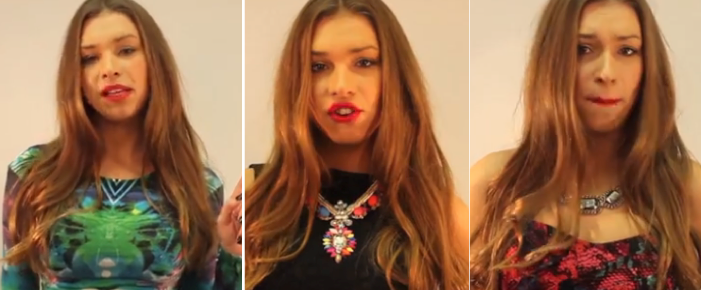
These are three examples of LUNA’s costumes throughout the music video. The digital print top being most evident within the music video. However, the other two costumes show bright colours, for example with the black dress LUNA wears a neon necklace – therefore we are maintaining this element. Additionally, the pink snakeskin costume exposes bright colours aswell. Although it is not just within the costumes that bright colours are shown, also within the lighting:

Within the music video for GRAMMY the motif sequence of these lights is repeated throughout to emphasise the colours significance as it represents LUNA’s personality and character. Thus, some of these colours are used for the digipak and poster – especially the colour purple.
Below shows a diagram highlighting the links between all of our media studies coursework spectrum. Evidently showing that the costume LUNA wears within the music video acts as a strong foundation and inspiration for the rest of our coursework.

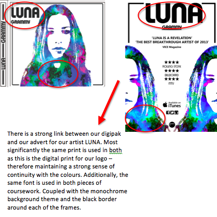
The print of the top was our inspiration for our LUNA logo. To maintain a strong level of continuity for the rest of our digipak and advert we used this print for the cover of our album and advert/poster, creating a pop-art image of LUNA. We believe that this print is extremely distinctive and original for our artist LUNA. There is also a strong link with the pop genre: bright colours and pop font and the focus of the artist as LUNA appears on the front cover of the album and poster.
Different Designs for Advert – Audience Feedback
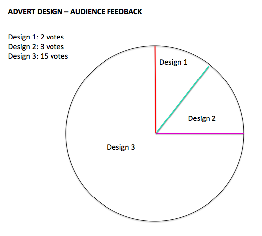
As we have designed 3 different options for our advert to promote our artist LUNA. We felt this was a prime opportunity to complete an extensive piece of audience feedback to find out what the general consensus was about our advert. Evidently, the pie chart displays our findings from this survey and Design 1 gained 2 votes, Design 2 gained 3 votes and Design 3 gained 15 votes. As our survey was completed by 20 individuals, our research shows that with a 75% gain – Design 3 ultimately seemed more popular with the public. As we also agreed with this answer, we have decided to create design 3 as our final advert.
Along with our survey we asked the people taking part: why have you chosen this design? and, what didn’t you like about the other designs?
The main comments made about these questions were:
– Design 1 and 2 were too similar to the digipak – almost identical. Therefore, if you choose Design 3 it is more original and reflects LUNA’s identity better.
– Design 3 demonstrates a balanced design
– The framing od Design 3 is original and cool
Similar Artists Digipak and Adverts – Research
We have completed extensive research on this topic in order for us to successfully create our own advert which links with our digipak. Our research shows that the main links between the digipak and advert for pop artists are:
1) The same font is used for the title and name of the artist
2) Extremely similar colours are demonstrated on each of the promotional pieces
3) The image of the artist is extremely similar on each of the pieces however there are always slight differences
4) Social networking icons are displayed on the advert: Twitter/Facebook/Website
5) More information is shown on the advert
6) Ratings and reviews from highly respected companies within the music industry
Checklist Before Advert Is Completed

This is a checklist we will be using to make sure our advert is completed on time. Advert due – Thursday 13th February 2014. This demonstrates our time management skills and organisation between the group.
3 Designs for our Advert
Below are the three different draft designs for our advert. They display the basic and rough outline/placing/framing of our potential advert.
Design 1: Luna’s face is placed in the middle of the advert
Design 2: Luna’s face is placed lower down the advert
Design 3: Luna’s face is cropped in half and placed symmetrically either side of the advert
We will be conducting a survey to find out what the general consensus of the advert is.


