Blog Archives
Finishing Our Digipak
As the deadline for our digipak is on Friday 31st January, it is very important we finish this before the deadline in order for us to carry out audience feedback so we have time to improve the digipak. Therefore it is necessary for us to communicate between the group to ensure we are all able to work on the digipak so it will be completed.

Digipak links to Artist/Music Video
During our Music Video, on two occasions, there are flashes of studio lights, consisting of a number of bright colours. Taking this into consideration, we have tried to make the colour scheme for our digipak, including the logo out of very bright colours. By doing so, links are established between the digipak and Luna giving a sense of continuity between the two pieces of media.
During our video, Luna is seen to mainly be wearing a bright top consisting of the colours; blue, purple and green. 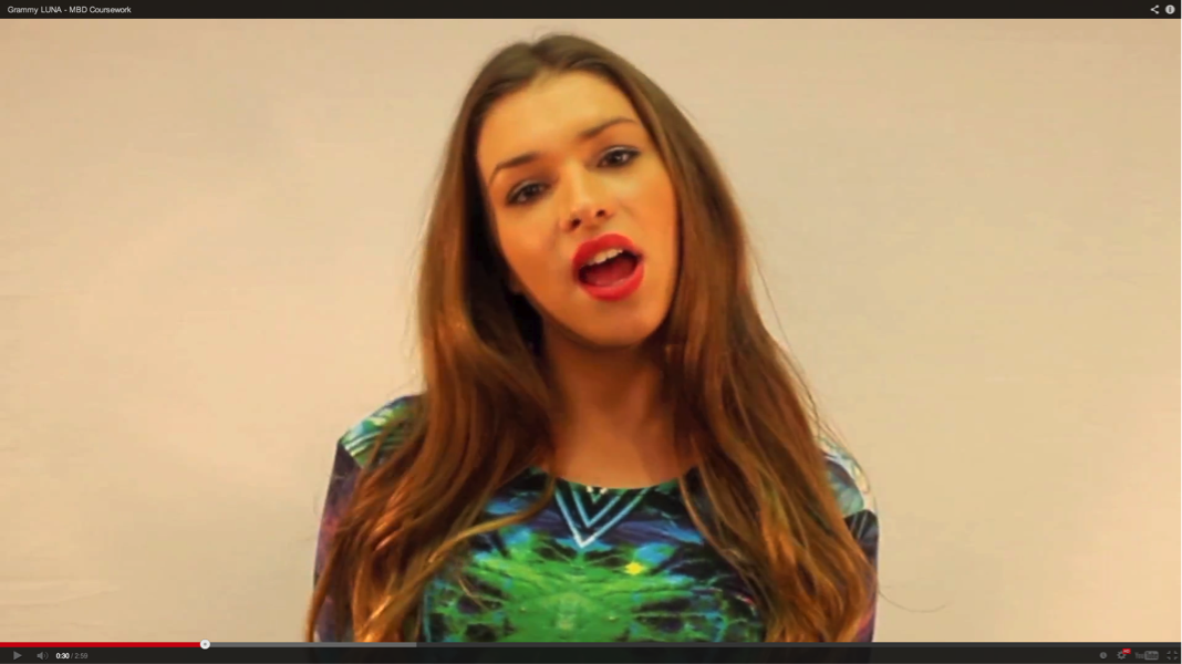 As this is the main outfit Luna wears throughout the duration of the video, we thought it would be appropriate to base our logo colour scheme off of this clothing.
These colours feature on the two disk covers we have. 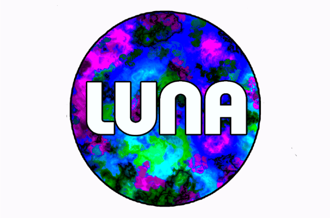 Our front cover for the digipak is an image of Zara, with a very bright white colour in the background. We think this links well with our artist and the music video because it is eye catching, bright and features a picture of Zara.
Changing the LUNA logo
Our original LUNA logo consisted of a full moon and two half moons attached on either side, also, the colours were slightly dull. Throughout the process of building our artist, LUNA’s identity has evolved into bright colours. Therefore, we felt it was necessary to include brighter colours in the logo as our music video consists of many bright colours and we wanted to continue this theme throughout Luna’s identity. Additionally, by carrying out extensive audience feedback many comments were made about the two half moons attached to the middle circle and no one could see the relevance of this feature on the logo. Thus, we decided to erase these 2 moons as they no longer had any relevance to our artist. We have decided to focus more on the bright colours on the logo, making it stand out and distinctive. We have also added in a black outline on the LUNA title and outline around the circle of the logo, this results in the name of LUNA standing out more.
Here is our new logo:

Here is our original logo:
![]()
Digipak Evaluation
Below is a video of MBD explaining our decisions made for our digipak draft. We considered our artists representation, audience and links to genre.
Below is a video of fellow classmates evaluating our Digipak draft. We received a lot of constructive critiscm from them and we are going to improve our Digipak by using their feedback.
Digipak Draft – Explanation

Album Cover:
Through extensive research we have decided to use bright colours throughout the album cover as this was very popular with other female pop artists such as Miley Cyrus, Britney Spears and Katy Perry. Also, as the use of bright colours is a prominent feature throughout our music video. Therefore, we want to continue using this theme. Additionally, as the artist usually appears on the front of ther album cover in the pop genre – we want to use Luna’s face as the album cover. Luna will be in the centre of the cover and she will be wearing an outfit shown in the music video, demonstrating continuity. The font will be the same as the Luna logo, showing a running theme.

The top that Luna will be wearing is a digital print top shown below:

We believe that this is a suitable outfit that reflects our artist, Luna’s identity. The bright colours of green, blue and purple are also the same as the new Luna logo – creating a similarity between the different aspects of Luna’s identity.
CD Disc:
The 2 discs will have a nebula print – the same as the one on the logo, again demonstrating continuity. We want to use the same print so the audience can see the links between the album cover and our artisty. Also, the same font – Xpress heavy SF – will be used. We originally wanted to have Luna’s eyes in the background of the ‘LUNA’ title, however, by carrying out audience feedback, people have commented that this will look to busy and chaotic. The disc will also consist of the same bright colours.

Picture Pages:
As we have noticed pop artists album cover’s generally revolve around the artists appearance and image of the person, we want to conform to this genre characteristic. Therefore, on the picture pages we want to have images again of Luna. As well as the track list and lyrics page.
Digipak Drawn Draft Requirements
Below shows a Scribd document listing the requirements for the drawn digipak draft requirements.
